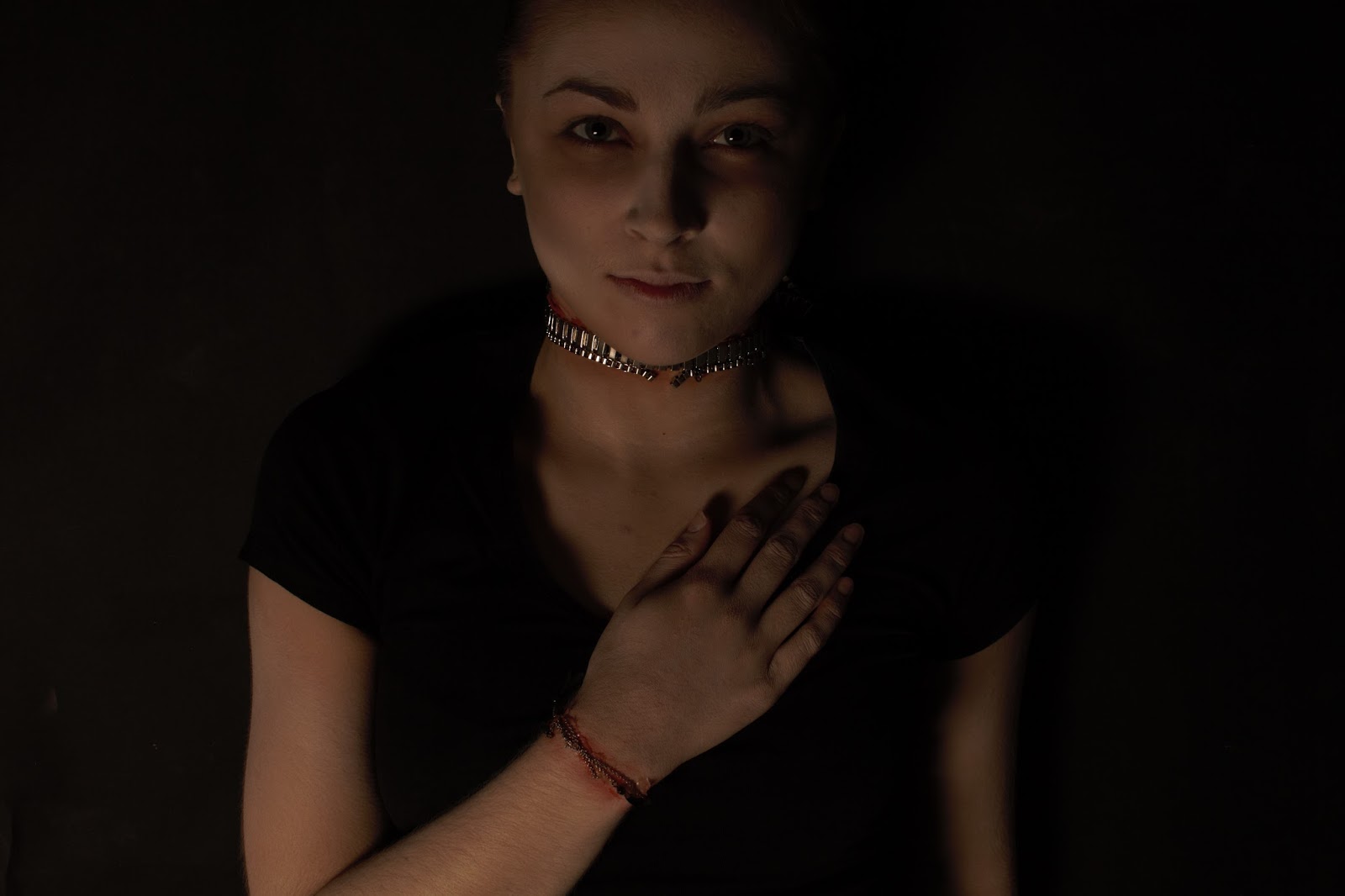
These are my final images of Claudia and Quentin, there wasn't much editing to do on the images as they were ok as they were. The only thing I needed to change was the brightness and a few other things to get the dullness on Quentin and the brightness on Claudia.
Quentin
Claudia
Thursday, 21 April 2016
Images Of Claudia & Quentin
Today I did both my photo shoots on my characters in the studios at uni.
Quentin I shot in a dark studio with one really dim light, a black background and black flooring too.
I was really happy with how the images came out and here are a few of my favorite ones -
I also did my photo shoot for Claudia too, I shot this in the studio too with a plain white background and two bright cameras facing my model to get a bright impact on the model.
I'm really pleased with how they came out and here are some of my favorite images before editing -

Reflection
I feel everything in my shoots went really well, the studios were great, the set ups were great, the lighting worked just fine and I didn't have any problems with any set ups.
I love the way the images came out for both character, the dark and gloomy look for Quentin came out really well and the bright and flowery look came out good too.
The only problem I had was with the gelatin on Quentin's neck, the necklace must have been too heavy for the gelatin so applying it laid down would have worked better but I wasn't able to place the gelatin in the studio as that would have been too messy.
Overall, there is nothing I would change about either of the looks apart from the gelatin not keeping the necklace on the neck properly but that is a situation that cant be helped.
Quentin I shot in a dark studio with one really dim light, a black background and black flooring too.
I was really happy with how the images came out and here are a few of my favorite ones -
I also did my photo shoot for Claudia too, I shot this in the studio too with a plain white background and two bright cameras facing my model to get a bright impact on the model.
I'm really pleased with how they came out and here are some of my favorite images before editing -

Reflection
I feel everything in my shoots went really well, the studios were great, the set ups were great, the lighting worked just fine and I didn't have any problems with any set ups.
I love the way the images came out for both character, the dark and gloomy look for Quentin came out really well and the bright and flowery look came out good too.
The only problem I had was with the gelatin on Quentin's neck, the necklace must have been too heavy for the gelatin so applying it laid down would have worked better but I wasn't able to place the gelatin in the studio as that would have been too messy.
Overall, there is nothing I would change about either of the looks apart from the gelatin not keeping the necklace on the neck properly but that is a situation that cant be helped.
Photo Shoot & Final Ideas
Claudia
For my final shoot on Claudia I am going to photograph her in the studio.
I have chosen to do this as I want everything white - to match my key word white rose. I think the white background, really bright lighting, white clothing, and the white rose will all add to the mystical look of the make up, the hair and the facial expression I want my model to have.
I feel the all white will be a sign of how pure and innocent she is, but her make up and her whole look will tell a different story showing she is actually a little crazy. I chose these designs because they link to my character being slightly crazy but but she still looks very cute too.
Here is my final mood board, final face chart and final hair chart fro Claudia -
Quentin
For my final photo shoot on Quentin I am going to photograph in the studio.
I have decided to do this because I feel if the background and the flooring was black, I can still get my model to lay on the floor but the darkness and the soft lighting would make a really good impact on the look of the character.
The background will be black, the lighting very soft, the clothing will be black and all the skin will be paled out with chains and gelatine on the neck and wrists.
I have chosen these designs because they link back to my character the most, looking sluggish and pale yet the hair still playing a part in being stylish too.
Here is my final mood board, final face chart and final hair chart for Quentin -

For my final shoot on Claudia I am going to photograph her in the studio.
I have chosen to do this as I want everything white - to match my key word white rose. I think the white background, really bright lighting, white clothing, and the white rose will all add to the mystical look of the make up, the hair and the facial expression I want my model to have.
I feel the all white will be a sign of how pure and innocent she is, but her make up and her whole look will tell a different story showing she is actually a little crazy. I chose these designs because they link to my character being slightly crazy but but she still looks very cute too.
Here is my final mood board, final face chart and final hair chart fro Claudia -
Quentin
For my final photo shoot on Quentin I am going to photograph in the studio.
I have decided to do this because I feel if the background and the flooring was black, I can still get my model to lay on the floor but the darkness and the soft lighting would make a really good impact on the look of the character.
The background will be black, the lighting very soft, the clothing will be black and all the skin will be paled out with chains and gelatine on the neck and wrists.
I have chosen these designs because they link back to my character the most, looking sluggish and pale yet the hair still playing a part in being stylish too.
Here is my final mood board, final face chart and final hair chart for Quentin -

Quentin Make-up & Hair Designs
For Quentin I want to produce a character that is like a dying vampire, I don't want to go too over the top but I want to make him look sad and hurting.
Here is my mood board for the idea that I have -
This is my first face chart -
Here is my mood board for the idea that I have -
This is my first face chart -
My second design is also very basic as he is dying and very sluggish looking his face will be contoured dark to emphasise the cheekbones and the eyes will be dulled out too. The gelatin will be plaved on the neck underneath the silver chain and will be reddened out to make the skin look sore.
This is my favourite design as it looks and relates more to my TV programme I've chosen - True Blood. With the chain on the neck the place skin and sluggish looking face.
My third design is very similar to the second but there is more gelatin and chains on the face. The skin will be paled out and contoured to look sluggish, the eyes are too. The chains will go across the forehead and across the chin area too - secured with gelatin and reddened to make the skin look sore.
Here is a mood board for the hair inspiration I had -
These are my hair charts too -
The first look is the hair in a fashionable side partin but his hair is messy and spiky - he has been used and abused to the messy look would work well for the character.
The second look is the hair all scrapped backwards off the face in a slick quiff - even though he has been used and abused the hair all slick back gives Claudia a better look at his face that she loves to look at. It is also very stylish and sleek which Quentin is.
The third look is very similar to the first design but the hair will be sleek and in place rather than messy and spiky. The character is very good looking and the hair is a big part of his looks so keeping him looking nice is what Claudia likes - even though she is killing him she still wants him to look "good".
This is my favourite design and I like how it links back to the character the most - keeping him looking good and sleek when he is about to die is probably what most people want anyway.
Tuesday, 19 April 2016
Sunday, 3 April 2016
Sweat & Fever
Today in lesson I learnt how to make the skin look sweaty and feverish using products over the make up base.
Health and Safety
Follow all health and safety guide lines making sure the client is ok during the process of the application of the glycerine and make up if using the alcohol to dilute the Supra colour
Make sure the client has no allergies and keep eyes shut when working near or around them
What I Used
- Red Supra colour
- Alcohol
- Sponge
- Make up brushes
- Glycerine
What I did
1. My model had make up on her skin - a foundation and powder base, instead of taking it off I wanted to see what it would look like over the make up.
2. I got some red supra colour and diluted it down with some alcohol to make the colour more translucent.
3. I blotted the red colour on the skin where the skin would usually go red if you had a fever - around the cheeks, the forehead and a little on the temples.
4. I used a brush to apply that and also my fingers to get it into the skin to make it look more natural.
5. I put some glycerine in to a bowl and blotted my sponge in to it, I then dotted the glycerine over the redness and also over the top lip where you would usually get a but sweaty if you was ill.
This is the finished look -
Reflection
I really liked the outcome of the look, as I wasn't sure if what I had done look natural enough but it did look really good.
I was surprised with how well the glycerine on the skin actually looks like sweat too and the redness on the skin makes it look more real.
I wasn't diss pleased with anything I did on my client as I think it turned out well. I would maybe do it again on normal skin with no foundation or product on underneath.
Overall, I am pleased with the outcome and the results I produced and I love the effect that the glycerine has on the skin.
Health and Safety
Follow all health and safety guide lines making sure the client is ok during the process of the application of the glycerine and make up if using the alcohol to dilute the Supra colour
Make sure the client has no allergies and keep eyes shut when working near or around them
What I Used
- Red Supra colour
- Alcohol
- Sponge
- Make up brushes
- Glycerine
What I did
1. My model had make up on her skin - a foundation and powder base, instead of taking it off I wanted to see what it would look like over the make up.
2. I got some red supra colour and diluted it down with some alcohol to make the colour more translucent.
3. I blotted the red colour on the skin where the skin would usually go red if you had a fever - around the cheeks, the forehead and a little on the temples.
4. I used a brush to apply that and also my fingers to get it into the skin to make it look more natural.
5. I put some glycerine in to a bowl and blotted my sponge in to it, I then dotted the glycerine over the redness and also over the top lip where you would usually get a but sweaty if you was ill.
This is the finished look -
Reflection
I really liked the outcome of the look, as I wasn't sure if what I had done look natural enough but it did look really good.
I was surprised with how well the glycerine on the skin actually looks like sweat too and the redness on the skin makes it look more real.
I wasn't diss pleased with anything I did on my client as I think it turned out well. I would maybe do it again on normal skin with no foundation or product on underneath.
Overall, I am pleased with the outcome and the results I produced and I love the effect that the glycerine has on the skin.
Sunday, 20 March 2016
Claudia Make-up & Hair Designs
Here are my ideas for my fairy inspired look, I wanted to produce something quite mystical but not too over the top. This is why I went with soft pinks and bronzey make up tones.
Here are some images that I got inspiration from to produce my make up look -
Here are my face charts and the practice looks I did on myself -
My last design is a take on the first one but just toned down a little.
The eye shadows are the same colours as the first design, but there is a more definition in the inner corners of the eyes than around the eye brow. The white dots add some colour and definition to the brown as also keeps it looking mystical. The face is preped the same as the other two designs with the foundation and contouring too.
I like this design too as I think it has an edge to it, the pink tones I really like too!
I did another mood board to show how I would like the hair and the inspiration I got -
These are my hair designs -
The first design her hair will be all wavey and crazy like her personality, she will also have a flower in her hair behind her ear - as the key word is white rose added flowers will be relevant. I would curl the hair using tongs and add some wax in to the hair to make it messy looking too.
My second design is the hair straight, as she is a little crazy she likes to look after her self so straight slick hair would fit too. I added random little plaits in to the design as they add a bit of texture and something extra in to the hair. Faeries usually have something different about them and the added plaits will look cute too.
The third design is the design I like the most, their hair is nicely curled and soft looking, at the front of the hair is a Swedish braid but loosely in the hair so at the front the baby hairs are coming out. In the end of the braid there will be flowers stuck in the plait too - as the key word is white rose the added flowers in the hair will relate to that too.
This is my favourite design as plaits and faeries are associated together, the messy ness of the hair shows how crazy she is and the flowers represent the key word and also gardens - where faeries are usually found.
Here are some images that I got inspiration from to produce my make up look -
Here are my face charts and the practice looks I did on myself -
For my first design I decided to go with a look that embraces the pink over the eye and up over the eye brow too. I think looking from the images I found inspiration from the over excessive eye shadow really works when you are thinking about faeries.
The skin will be bronzed and contoured too, the eye brows will be filled in and the white dots will add to the mystical-ness of it all too.
I like this design as I think it looks cool and edgy, the soft pink tones work really well for fairies I think they are quite soft looking and nothing too harsh. The dots add some features to the look as well as making the looker think there is something mystical about this person.
This look I got inspiration from a Nars advert where the cheeks and temples are bronzed yet pinky toned too. I really liked the idea as I can change it in to something more mystical.
I did the skin as normal using foundation and contouring around the face. I did the eye brows and used a shimmery brown all over the eye lids up to the brow bone. Then I used a bronzer and a pink eye shadow to create the look around the cheeks up to the temples too on to the forehead.
I like this look as it is a bit more normal than the other two designs but I do really like the pinkness on the face I think it adds some character and it also still makes it look mystical as not many people would wear this look as an every day thing.
My last design is a take on the first one but just toned down a little.
The eye shadows are the same colours as the first design, but there is a more definition in the inner corners of the eyes than around the eye brow. The white dots add some colour and definition to the brown as also keeps it looking mystical. The face is preped the same as the other two designs with the foundation and contouring too.
I like this design too as I think it has an edge to it, the pink tones I really like too!
I did another mood board to show how I would like the hair and the inspiration I got -
These are my hair designs -
The first design her hair will be all wavey and crazy like her personality, she will also have a flower in her hair behind her ear - as the key word is white rose added flowers will be relevant. I would curl the hair using tongs and add some wax in to the hair to make it messy looking too.
My second design is the hair straight, as she is a little crazy she likes to look after her self so straight slick hair would fit too. I added random little plaits in to the design as they add a bit of texture and something extra in to the hair. Faeries usually have something different about them and the added plaits will look cute too.
The third design is the design I like the most, their hair is nicely curled and soft looking, at the front of the hair is a Swedish braid but loosely in the hair so at the front the baby hairs are coming out. In the end of the braid there will be flowers stuck in the plait too - as the key word is white rose the added flowers in the hair will relate to that too.
This is my favourite design as plaits and faeries are associated together, the messy ness of the hair shows how crazy she is and the flowers represent the key word and also gardens - where faeries are usually found.
Subscribe to:
Posts (Atom)